Fully 2½ months after this diabolical exercise started, the escalators are both back in service – as of yesterday, it appears.
(“Which escalators?” You must be new here.)
The upstairs hoardings, and blocked-off door, and frequently-dishonest signage concerning this escalator reconstruction, are all in place. Hoardings downstairs are – pleasingly – cleanly removed. What’s curiously missing now at both locations is this pair of signs –
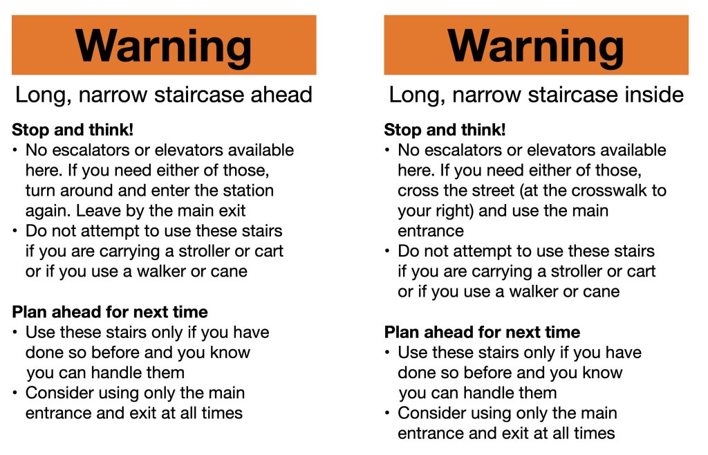
– which I typeset, printed, walked over, and taped up in plain view of everyone on a Sunday evening. The upside is at least I used real Helvetica, instead of the bullshit Bitstream clone the Windoids at the TTC defend to the death. (They’re the world’s only Helvetica truthers, insisting some typeface called “Swiss 721” came first.) The downside is I ran out of tape.
Thereafter, I observed precisely one person even noticing these signs existed. My handiwork did nothing to dissuade people from trudging down a punishing 150-step staircase. Still, my samizdat intervention here is way better than anything the dumb and undiscerning dweebs at the Commission could ever have come up with.
How dumb and undiscerning?
They can’t even render the name of the street right
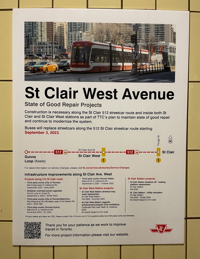
Guess frigging what, Sherlock: This is St. Clair Ave. West.
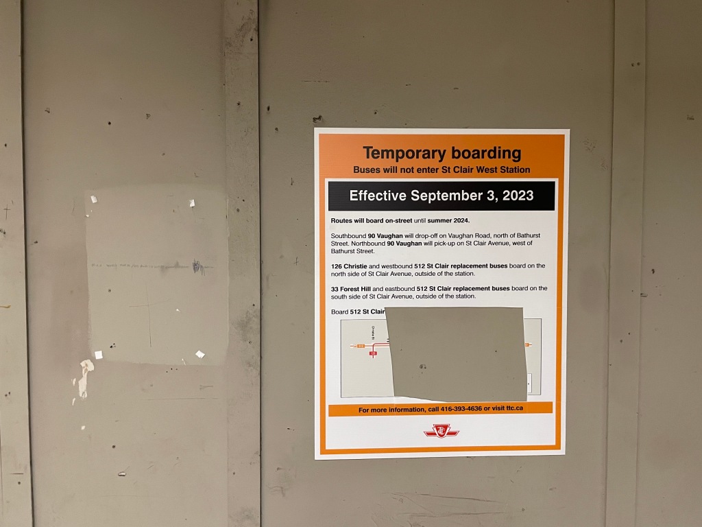
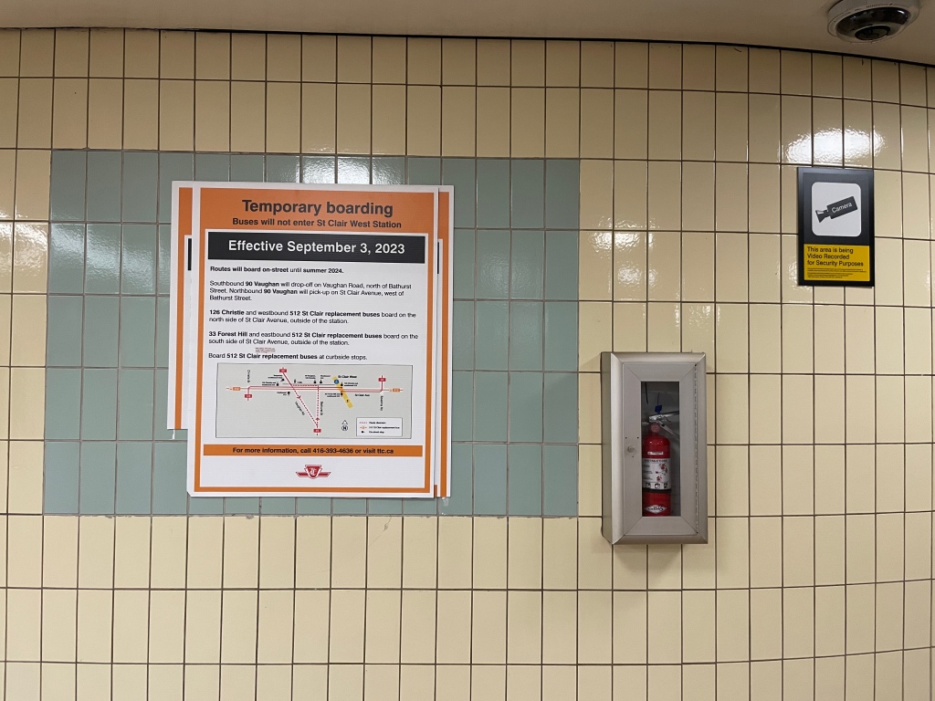
(Unrepaired a month later. Also, why precisely is there a route map on this sign? Apart from filling up space?)
For Helvetica truthers, these guys sure seem fond of Arial
TTC’s construction notices (I have other examples) are all banged out in Arial in Word for Windows, with the expected type and copy.
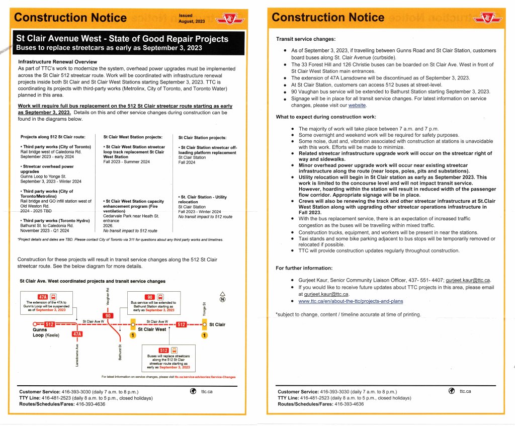
No Windows user will have any ability at all to find fault with what is presented here.
Oh, but station signage is also banged out in Arial.
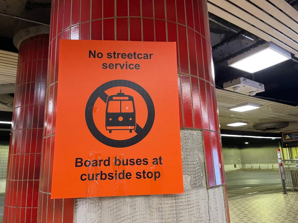
This one’s a fave:
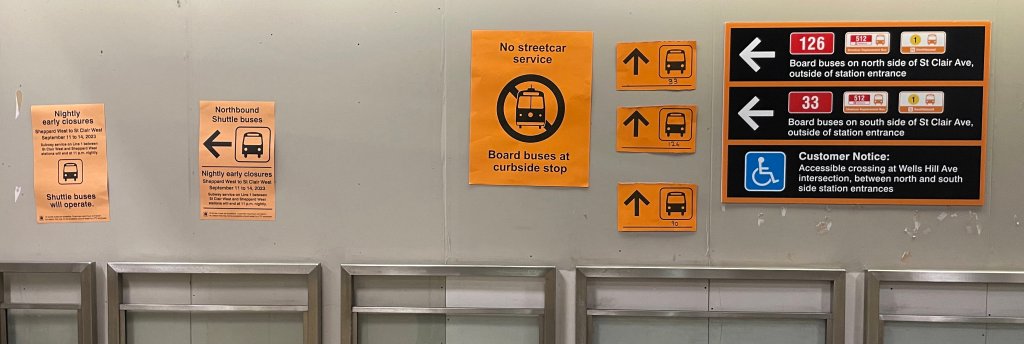
Note the redundant panels (cut out with scissors) pointing upward, with cutesy bus icons. Route numbers are Sharpied onto the solid line that is helpfully provided. Except you can’t get the ghetto Vaughan bus from St. Clair West station.
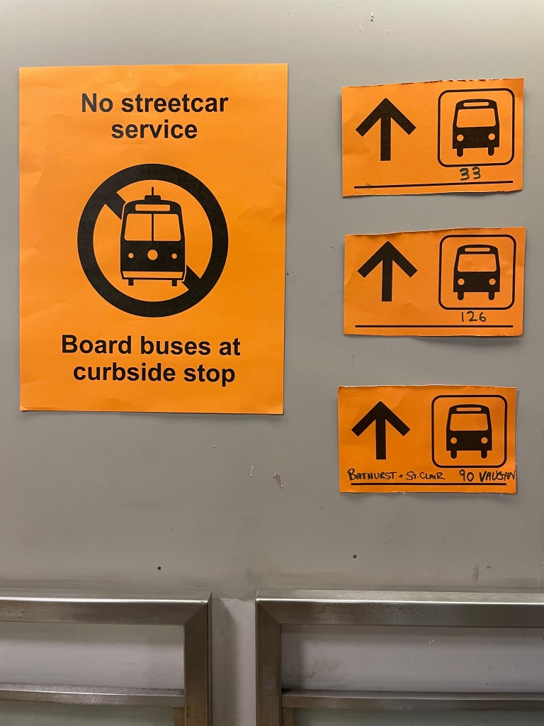
You can’t even get it from “Bathurst + St. Clair,” as somebody later scrawled on that same sign. No driver of the 90 will pick you up, or drop you off, at that corner.
This is the best the TTC can come up with to counter the epic bad press of the St. Clair disaster
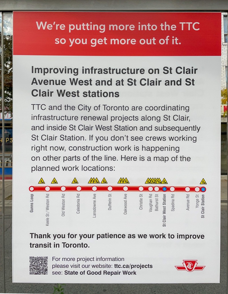
This blandishment is more turkey than Christmas, and additionally betrays the Windows contempt for typography. The headline as set –
Improving infrastructure on St Clair
Avenue West and at St Clair and St
Clair West stations
– puts errant linebreaks inside proper nouns. Set correctly so it can actually be understood on first reading:
Improving infrastructure on
St. Clair Ave. West and at
St Clair & St Clair West stations
Or:
Improving infrastructure
on St. Clair Ave. West
and at St Clair & St Clair West stations
(Punctuation duplicates expected usage in running copy and as rendered on station walls. No, they aren’t the same, and there is no such place as “St Clair Avenue West” [any more than there exists a “St Clair West Avenue”].)
Are we done yet? Nope.
Again: How dumb and undiscerning?
Ripped-down signage is just ignored or papered over.